16/11/2025 11:1128
Printing involves physical materials, ink distribution, machines, and precise measurements. Even a tiny error, like forgetting a bleed, can ruin an entire print batch. When accuracy is ignored, the final product suffers in quality, consistency, and brand presentation.
A simple mistake like a missing embedded font can force a reprint. That means:
Extra expenses
Missed deadlines
Wasted materials
Lost clients
In digital design, screens display light. In printing, colors are created by ink on paper. What you see on screen is not always what you’ll see on paper.
Print is unforgiving. There is no undo button. If your design is misaligned or blurry, it will show up exactly that way on the printed product. That’s why every technical detail matters.
RGB is for screens. CMYK is for print. When an RGB file is printed, colors shift and look dull. Using CMYK ensures color accuracy.
Images pulled from the web are usually 72 DPI—too low for print. Print requires at least 300 DPI to avoid pixelation.
Bleed ensures no white edges after trimming. Safety margins protect important text from getting cut.
Some formats compress quality. Always use print-friendly formats such as:
PDF (preferred)
TIFF
EPS
Using fancy, unlicensed, or non-embedded fonts causes errors.
Printers may replace missing fonts, ruining your design.
Too many shadows, glows, or transparency effects can cause printing issues or unexpected color results.
Logos, colors, and typography must match the brand style guide.
Inconsistency weakens brand identity.
Colors look different on glossy, matte, or textured paper.
Ignoring this leads to unexpected print outcomes.
Misaligned text or skewed elements look unprofessional and become obvious when printed.
Light text on a light background may look fine on screen but becomes unreadable in print.
Typos are embarrassing—and expensive to fix after printing.
RGB prints appear washed-out because printers cannot reproduce bright screen-based colors.
Low-resolution images lose sharpness, making the final print look cheap.
Without bleed and safe zones, borders, text, or graphics get chopped off during trimming.
Crooked spacing or off-center layouts can ruin the overall look and professionalism.
Errors in your design mean:
Reprints
Extra fees
Wasted time
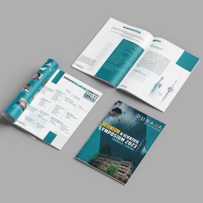
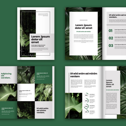
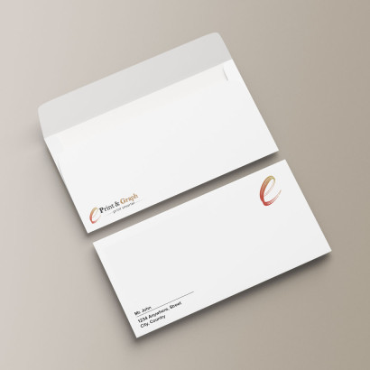
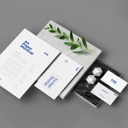
A poorly printed brochure or business card directly impacts how clients perceive your brand.
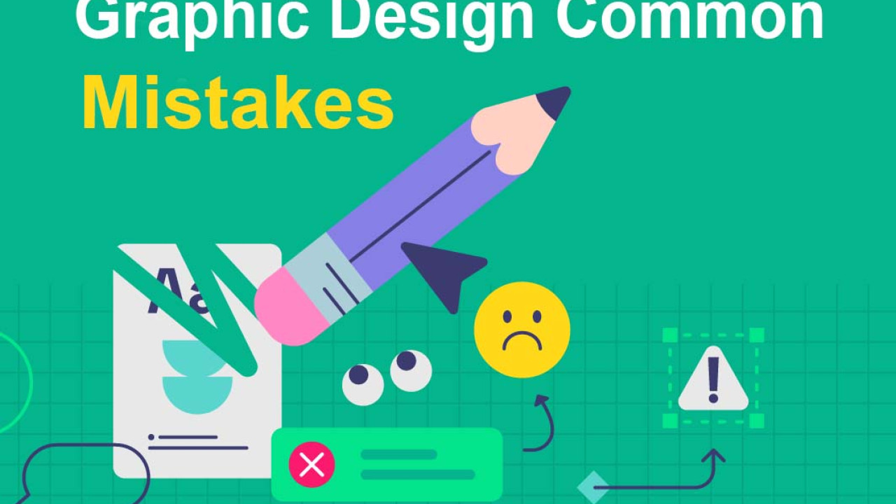
Designing for print requires careful attention to detail. While digital screens allow flexibility, print demands precision. By avoiding common design mistakes—like ignoring bleed, using low-resolution images, or designing in RGB—you can ensure your printed materials come out sharp, professional, and exactly as intended. Whether you're creating business cards, brochures, posters, or packaging, following print-ready guidelines will save time, money, and headaches
No recent blog!